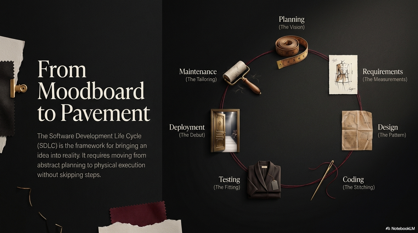
From Mockup to Prototype - The Design-First Workflow for AI-Built Apps
Learn the design-first workflow that turns one shared mockup into design tokens an AI coding tool can build consistently across iOS, Android, and web.
Most vibecoders open an AI coding tool and start typing prompts before they know what the app should look like. The result is rework: the AI guesses, you correct, it guesses again. Decide how your app looks and flows first, then hand the AI a finished mockup as the single source of truth.
This is the design-first workflow. You climb a fidelity ladder, raising the detail of your design one rung at a time. Each rung answers a different question. You stop climbing the moment you have enough certainty to build. Then you convert your decisions into design tokens, a machine-readable list of colors, spacing, and type sizes the AI can apply the same way everywhere.
The fidelity ladder
Fidelity means how close a design is to the finished product. A pencil sketch is low fidelity. A clickable prototype is high fidelity. Higher fidelity costs more time, so climb only as far as you need.
Step 1: Sketch
A sketch is a rough drawing on paper or a whiteboard. You draw boxes, arrows, and labels by hand. No tool, no color, no precision.
What question it answers: Does this idea make sense at all? Sketching forces you to lay out the screens and the path between them before you invest any effort.
What it costs: Minutes. Throw away ten sketches in the time one wireframe takes.
What tool: Pen and paper, or a whiteboard. That is the whole toolkit. Photograph the result if you want to keep it.
Stay here while the idea is still moving. The moment a sketch survives a few rounds of edits, climb to a wireframe.
Step 2: Wireframe
A wireframe is a grey-box layout. You replace every element with a plain grey rectangle: an image becomes a grey box, a button becomes a grey pill, a paragraph becomes grey lines. No color, no fonts, no branding.
What question it answers: Where does everything go? A wireframe settles structure and hierarchy, which element sits where and which one matters most. Removing color keeps you focused on the layout instead of the look. The Nielsen Norman Group calls this avoiding “premature commitment to visual details”.
What it costs: An hour or two per screen at first, less as you reuse pieces.
What tool: Figma is the standard. It is free for individuals and runs in the browser. You can also wireframe with simple shapes in any drawing app.
A wireframe answers layout questions cheaply. Do not add color here. Color decisions belong one rung up.
Step 3: Mockup
A mockup is the wireframe with full visual design applied: real colors, real fonts, real spacing, real icons, real content. It shows exactly how one screen will look when finished. It does not click or move yet.
What question it answers: What does this app actually look like? A mockup makes every visual decision concrete, so nothing is left to interpretation later.
The single most important rule: Build one mockup in one design language, and make it identical across iOS, Android, and web. Do not design three separate looks. A shared visual system means the same colors, spacing, type scale, and components everywhere, with only platform conventions changing underneath. This single shared mockup becomes your source of truth. For the full method, read designing across iOS, Android, and web . For spacing and hierarchy decisions inside the mockup, read white space and visual hierarchy .
What it costs: Half a day to two days for a small app, depending on screen count.
What tool: Figma again. Build a small set of reusable components (button, card, input) and apply them across every screen.
Step 4: Prototype
A prototype is a mockup made clickable. You connect screens so tapping a button moves you to the next screen. It simulates the real flows without a single line of code.
What question it answers: Does the flow feel right? A prototype lets you and your testers walk through a real task, like signing up or checking out, and feel where it breaks.
What it costs: A few hours on top of finished mockups. Figma turns mockups into prototypes by drawing links between screens.
When to stop climbing: Stop the moment you can answer your open questions. If the flow is obvious, a mockup is enough. Build a clickable prototype only when the flow is complex or when you need to test it with real people first. Climbing past your certainty wastes time you could spend building.
Hand the mockup to the AI as the source of truth
Once your shared mockup is done, it becomes the single reference an AI coding tool builds against. This is what separates a clear instruction from a vague prompt. Instead of writing “make a nice login screen”, you point the AI at the mockup and the tokens behind it. If you are new to directing AI coding tools, start with what is vibe coding .
A design-first workflow reduces rework for one concrete reason. When the AI writes code with no visual reference, it invents the colors, the spacing, and the font sizes. Every screen it generates invents them slightly differently. You then spend more time correcting drift than you saved by skipping the design. When you give the AI fixed values up front, it applies the same ones everywhere, and the output matches across screens and platforms on the first pass.
The bridge from a mockup to the AI is design tokens. A design token is a named value for one visual decision: a color, a spacing step, a corner radius, a font size. Tokens turn the choices inside your mockup into a machine-readable list the AI can apply consistently. Read the values straight off your finished mockup and write them down.
{
  "color": {
    "brand-primary": "#e0314b",
    "brand-on-primary": "#ffffff",
    "surface": "#161616",
    "text-primary": "#f0ede8",
    "text-secondary": "#9a9086",
    "border": "rgba(255, 255, 255, 0.08)"
  },
  "spacing": {
    "xs": "4px",
    "sm": "8px",
    "md": "16px",
    "lg": "24px",
    "xl": "40px"
  },
  "radius": {
    "sm": "6px",
    "md": "12px",
    "pill": "999px"
  },
  "type-scale": {
    "body": "17px",
    "h3": "20px",
    "h2": "24px",
    "h1": "44px"
  }
}
Give this file to the AI with one instruction: use these tokens for every color, space, and font size, and never hard-code a raw value. Now the AI has no room to guess. A button uses radius.pill and color.brand-primary on iOS, Android, and web alike. Change one token and every screen updates the same way.
In a React Native or web project, the same tokens become a typed object the AI imports and references by name.
export const tokens = {
  color: {
    brandPrimary: "#e0314b",
    surface: "#161616",
    textPrimary: "#f0ede8",
  },
  spacing: { xs: 4, sm: 8, md: 16, lg: 24, xl: 40 },
  radius: { sm: 6, md: 12, pill: 999 },
  type: { body: 17, h3: 20, h2: 24, h1: 44 },
} as const;

// The AI references tokens by name, never a raw value:
// padding: tokens.spacing.md
// borderRadius: tokens.radius.pill
// backgroundColor: tokens.color.brandPrimary
The four levels at a glance
| Purpose | Time cost | Tool | When to use | |
|---|---|---|---|---|
| Sketch | Test the idea | Minutes | Pen and paper | Idea still moving |
| Wireframe | Fix layout | Hours per screen | Figma | Structure unclear |
| Mockup | Set the visual design | Half a day to two days | Figma | Ready to define the look |
| Prototype | Test the flow | A few hours | Figma | Flow is complex or needs testing |
Climb only as far as your questions require. For most small apps, a shared mockup plus a token file is the right place to stop before you build. Hand both to your AI tool and let it write code against fixed, named values instead of guesses.
Further reading
- Wireframing (Nielsen Norman Group) : research-backed guidance on low-fidelity layout and when to add detail.
- Prototyping (Interaction Design Foundation) : the difference between low and high fidelity prototypes and when each fits.
- Figma : the standard browser-based tool for wireframes, mockups, and clickable prototypes.
- Material Design 3 : Google’s design system, including its token model for colors and type.
- Apple Human Interface Guidelines : Apple’s platform conventions to respect under a shared visual system.
- Designing across iOS, Android, and web : how to keep one mockup identical across all three platforms.
- White space and visual hierarchy : how to set spacing and emphasis inside a mockup.
- What is vibe coding : how non-engineers direct AI coding tools to build working apps.